Top SaaS homepage Design Mistakes You Should Avoid to Get More Conversions

Top SaaS homepage Design Mistakes You Should Avoid to Get More Conversions
Your Saas homepage design as the forefront of your business. Just as the forefront of a brick-and-mortar business gives people a sneak peek at the products or services of the store, the homepage is where you provide a schematic overview of your products or services. It helps people decide whether you’re the business they’ve been looking for. Your homepage has a key role in converting your visitors. Failing to optimize your homepage for more conversions means missing out on a huge growth potential. In this article we explain top SaaS homepage design mistakes you should avoid to get more conversions.
Mistake#1- Not having a CTA above the fold
For some people the debate on above the fold or below the fold might seem redundant. From their perspective people are used to scrolling down the pages and are expecting to see CTA’s (call to actions) below the fold. They might advise people to insert their CTA’s below the fold to have the most effect. However, a study by Nielsen Norman Group tried to “empirically” show that people’s behavior is impacted by the fold: “users stopped scrolling before finding the information they needed, or worse, didn’t realize that there was more information waiting for them below the fold.” The report explicitly mentions: There’s also quantitative evidence: in an analysis of 57,453 eye tracking fixations, we found that there was a dramatic drop-off in user attention at the position of the page fold. Elements above the fold were seen more than elements below the fold: the 100 pixels just above the fold were viewed 102% more than the 100 pixels just below the fold. This has a strong homepage optimization message for SaaS marketers: Since the homepage is the most important landing page of your SaaS website and it contains so many important elements, it should be optimized to show the most important elements above the fold. Here are a few elements you need to show above the fold: 1- Your logo 2- Navigation menu 3- Your unique value proposition (UVP) statement 4- Main call to actions (CTA’s) Textedly’s homepage is a good example of how a Saas homepage should showcase the critical design elements.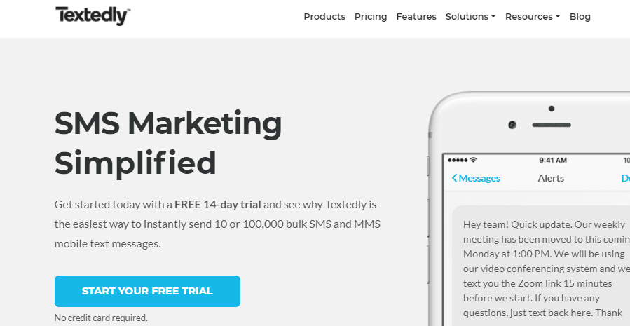
Mistake#2- Having a singular CTA
Speaking of CTA’s and their importance to get your viewers’ attention, it’s a good idea to think about what types of CTA’s to use in a homepage. There has been a debate about the type and number of CTA’s you should use in a homepage. Some people argue that a singular CTA eliminates the distraction and directs people’s attention to only one action. It makes sense that using only one CTA will make the decision-making process way easier for your visitors. MorningBrew’s homepage contains only one CTA to increase the number of their email subscribers.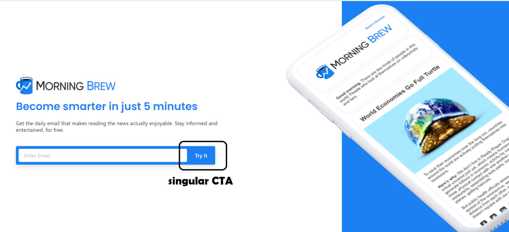 But MorningBrew is a free email subscription company and their sole intention from having a website is increasing their subscribers. Subscribing to a free newsletter company is basically risk-free for users. They could simply “Try It” as the CTA offers. What if you’re a SaaS company with a product to sell? Can you simply have a “Buy Now!” CTA above the fold and expect people to act on it? Some marketers might disagree with having a singular CTA on the homepage because it would attract only a portion of your visitors. People come across your website with different intentions. They might be looking to review your products, they might tend to read your blog, or they might have done their research and only visit your website to buy right away from you. In this case, it makes perfect sense to include some CTA’s with different intentions to make sure you’re eliciting some action from all your visitor segments. In a study published on WordStream, I found that 94% of the top business websites I analyzed used multiple CTA’s in their whole homepage. Also the majority of the websites that used CTA’s above the fold had used this CTA combination the most: “Sample + More info” type. The rationale behind this might be that a large portion of your first time visitors are not yet ready to make a purchase. They’re looking to find more information about your products or see a risk-free sample of your work. Looking for more CTA examples, check out these CTA examples by ReferralCandy.
Mistake#3- Missing out social proof
Social proof is one of the most important trust signals on your homepage. When visitors first land on your SaaS homepage, they’re analyzing the content to see if you’re trustworthy. The claims you make about your products won’t earn your visitors’ trust singlehandedly. Combine them with other trust elements such as social proof, and you’ll see a great increase in conversions. Some of the most popular social proofs are:
- Case studies: You could mention the detailed success story of your clients.
- Testimonials: You could use recommendations from your happy customers.
- Reviews: You could feature real reviews of your products or services by trusted sources.
- Social Media: Showing how many followers you have or showing their positive posts about you is a good way to gain new visitors’ trust.
- Trust Icons: You can showcase the logos of the companies you’ve worked with or the publications you’ve been featured on.
- Data/Numbers: If you have worked with an impressive number of people or have achieved impressive results with them, you can show the data/numbers on your homepage.
Getting any of these social proof elements for your website is easier said than done. You need to have a really good track record so that you could get testimonials from your clients. Reach out to your loyal clients and ask for testimonials. You should also actively reach out to bloggers with a suitable subject line and ask them to review your products in their review articles. An example of a great review article to be featured on is Ben Aston’s best project management softwares review. You might want to offer them a free trial of your software and an affiliate link to get featured in their review articles. You can then take an extract from the article and feature it on your homepage as a positive review Using any of these elements on you r homepage would make it possible for your visitors to trust you. GetResponse uses various social proof types on the homepage to build the most level of trust with their visitors.Another way to build trust with your homepage visitors is being there to assist them in the issues they’re facing. This will inevitably improve your customers’ journey. As Ben Aston explains, improving the “customer journey” has proven to increase revenue up to 15% while also boosting customer satisfaction by around 20%. Using a suitable ticketing software or live chat software on your website is a great help.
Mistake#4- Missing out key product details
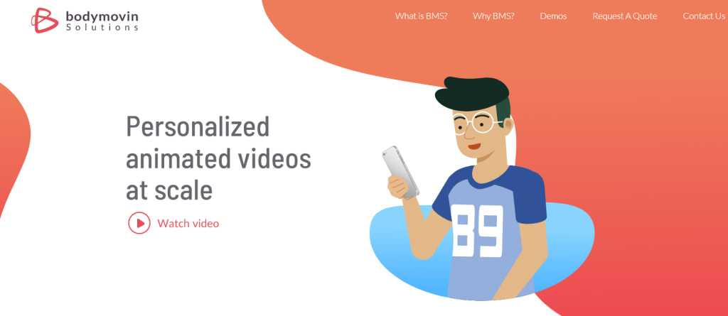
Curious homepage visitors typically look for the key product details that appeal the most to them. If they’re the most concerned about the pricing, they skip all other information to find your pricing section. If they’re worried about migration issues, they keep their eyes peeled for any information you mention regarding seamless migration assistance. This holds true for company values as well. People trust Saas companies they consider humane. Including a section explaining about your customer-centric values and dedication to offering real value to people could help gain people’s trust. So any benefits or features that are decisive for your visitors should be mentioned somewhere on the homepage. One way to find out what’s considered a decisive feature or benefit for your audience is sending surveys to your current customers. A survey tool such as SurveyanyPlace is a great help here. Diffy, a visual regression testing tool does a great job featuring their product’s key benefits in a relevant and easy-to-consume manner.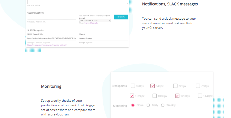 Possibilities for showcasing your product’s decisive features in an attention-grabbing manner are endless. Videos for example have a great potential for keeping your homepage visitors hooked while educating them about your key features. BodyMovin is a SaaS startup that offers animated videos at scale. Guess what? Their whole homepage has animated elements, showcasing their great animation skills. They use a couple of videos to introduce their product and how it helps you personalize user experience.
Finally:
A SaaS company is more or less dependent on the performance of its website since all other marketing channels would lead back to it. Blog posts, social media ads, newsletters, events, etc. all have the intention to drive traffic to a company’s website and convert it. The problem begins when the most important pages of that website (aka the landing pages, aka the homepage as the most important one) are not optimized to convert visitors. All the time and budget spent on other channels would simply go to waste. To stop this from happening you need to optimize your SaaS homepage design to convert the most visitors. You can test various elements on your homepage using A/b testing tools and find out what’s working best for you. Aside from that, you can use some of the true and tested ideas in CRO. In particular you can:
- Have your most important design elements above the fold (the first 100 pixels of the page).
- Use various CTA types to convert visitors with different intentions.
- Use suitable social proof to gain people’s trust.
- Showcase your product’s key benefits and features
 INBOUND MARKETING BEST PRACTICES TO INCREASE SAAS COMPANY’S SALES DOWNLOAD YOUR E-BOOK
Tags:
SaaS GrowthJanuary 15, 2021

Comments