How to Optimize Your SaaS Pricing Page in 2021? [Complete Guide 2021]
How to Optimize Your SaaS Pricing Page in 2021? [Complete Guide 2021]
Psychological facts about your consumers + advanced pricing page tips + real SaaS examples = your SaaS pricing page is ready to close! Let’s assume your SaaS pricing page is the final food you want to prepare and you have to use the right ingredients in the right way. Design, pricing strategy, the order of pricing plans and other elements are your ingredients. You can combine powerful design solutions and persuasive title with buyer persona-focused plans and don’t be surprised, your pricing page is all set to close more customers. So keep reading to discover how you can prepare the most “appetizing” SaaS pricing page. Before we start, we want to mention that some SaaS companies offer Contact us option instead of introducing separate plans. For example, look at LeanLinking who provides tools for procurement and supplier management. You can write your message, contact them and get a quote that is designed considering your exact goals. Or when you visit DataHen’s website (web scraping services), you fill in a form, tell what kind of data you need and get a quote. When is it preferable to design your pricing like this? In most cases, companies don’t mention prices because it’s difficult to divide the services into separate plans and the cost totally depends on the request. If this is not the case for your company, then keep reading!
SaaS pricing plans: Where to start from and where to go?
Well, your first step is to figure out which pricing strategy or business model you will go after. In other words, what’s your value metric. If we look from the “technical” side, you can charge monthly, annually or both ways. The third case is what SaaS companies usually do. The truth is, annual billing is what you’d like to see – reduced churn rate and projected revenue. On the other hand, customers are not always ready for a long-term commitment. Being flexible will create new tasks for your team in terms of calculations but you will attract a greater number of customers too. When it comes to the “practical” part, here are the most popular pricing models: 1. Per-user pricing – based on how many users use your software (Jira) 2. Flat rate pricing – a single fixed price monthly no matter how many users (Basecamp) 3. Pay as you go – based on what features customers use (Amazon Cloud Server) 4. Per storage pricing – based on how much space the customer needs (Google Drive) 5. Feature-based pricing – the more features the business needs, the higher plan it should choose (QuickBooks). Which business model your SaaS company should follow depends on what type of service or product you offer. The most common models, though, are per-user pricing and feature-based pricing. Our next sections are dedicated to consumer perceptions and best practices of creating a high-performing pricing page. You will learn what details to consider and how to take your SaaS pricing page to a higher level.
User psychology: How prospects think and how to make them want your SaaS
Psychological elements are the spices of your page and they decide your pricing strategy. Several ingredients fall under this category, from pricing principle to offering a recommended plan. But let’s move forward step by step.
About buyer personas
Design a separate plan for each buyer persona you target. That’s the first tip we would like to give you. Your every persona has its unique needs and goals and you know them perfectly because you have done your research. Let’s see how SaaS companies follow this principle. FreshBooks who offers accounting software has created 4 plans for 4 personas: self-employed, small business, growing business and thriving business. When a growing business owner visits this page, he is already directed to the third plan. It makes him think “Here it is. We are a growing business. Let’s see the details.” and come to a decision faster. Or SDL Trados, a translation software provider, has targeted 3 main groups on their page: translators, translators with 2 PCs and global teams.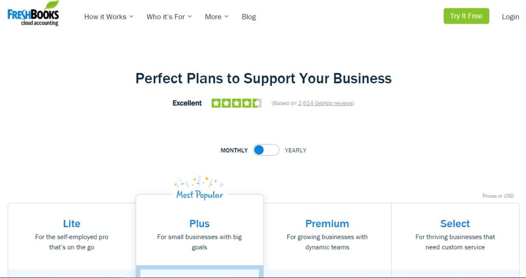
About defining your price
You will also see that prices are not always round numbers. For example, when you look at pricing pages of Ahrefs ($99, $179, $399), Riddle ($19, $49, $249) or Hootsuite ($19, $59, $599), you will see prices ending with 9, not 0 or 5. That’s because, for example, 99 is associated more with 90 than 100.
About the price tiers
When you have a single plan, the prospect is considering whether to buy from you or not. But when you have 2+ plans, the prospect thinks which one to buy. Moreover, offering 3 different prices is regarded as the most effective tactic. “This one is too little for me, that one is too much for me. I will choose the one in the middle.” This is how approximately most prospects make their estimations.
About social proof
Have you heard about mob mentality? It’s when people follow the behavior or opinion of their peers rather than try to find a rational explanation. That’s why including feedback on your pricing page from your previous customers can be a truly influential factor. On 3dcart’s Pricing page (they are an e-commerce platform, designed to help online store owners succeed) you can see both short testimonials from their customers and the logos of well-known companies they have partnered with. Your visitors will definitely start appreciating you more if they hear positive feedback about you from other people or discover that global companies have decided to partner with you.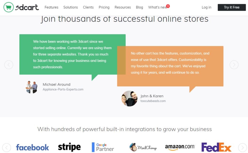
About recommending a certain plan
Do you think of recommending one of your plans? Yes, that’s a nice idea because you kill three rabbits with one shot. First, you help and guide your prospect if he is confused. Second, you impact his final decision if he can’t decide between your pricing plans. Finally, you awaken the fear of missing out. “If most people choose this tier, then it’s the most convenient one. I also must use it”. Look at the examples of BuzzSumo, ActiveCampaign or Moz. They all follow this simple principle. Some call it “Recommended”, others say “The most popular” but the idea is the same.
About the order of plans
You probably think that your free plan should be on the left side and your paid plans should go from less to more expensive. But that’s not the best decision. You visited the pricing page, you saw $299 and said: “Oh, that’s too much. I don’t need that high price. But wait, #14.99 sounds pretty good. It’s excellent for me.” When you see the large number and then a smaller one, that second option seems even smaller in your eyes. See, Hello Bar is one of the few examples.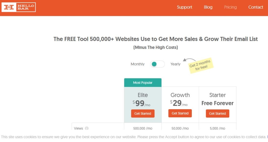
The best spices for the best pricing pages: Start closing even more…
#1 Value metrics of your pricing tiers
It’s natural that your software has both primary and secondary features. Providing 24/7 support is a secondary feature because your customers don’t get the actual value of your software from that feature. But if you charge your customers based on the number of software users and number of videos they can edit (let’s assume you offer video editing tool), those two numbers become the value metrics of your tiers. And those metrics should clearly appear on your plans as key value providers.
#2 Your pricing page title
Don’t forget to spice up your pricing page with a special title that will communicate a clear and promising message. In many cases, on the top of the page, we read “All plans include free trial” or “No credit card required”. But let’s look at, for example, Marvel’s title: “Supercharge your design productivity” or Unbounce’s title: “Pick a plan to power up your marketing”. Wistia’s pricing page title is also worth mentioning: “Get more from your marketing videos. Choose your plan. Put on a party hat. Make video marketing magic”.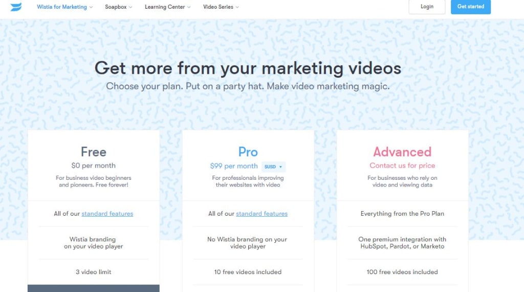 Of course, you want to communicate additional messages to your visitors but you can add them to other parts of your page and draw attention with a promising and beautiful title.
#3 Simplicity of your page
“Never overlook the power of simplicity”. This is a quote by a Canadian writer who has nothing to do with SaaS but what he says has much to do with your SaaS pricing page. Don’t think that the more complicated your language is, the more influence you have on your visitors. Help them compare your plans, highlight the main differences but do it in a simple and understandable way. This refers not only to features but pricing mechanism too. For example, HubSpot’s pricing is a bit difficult to understand. First, you choose a plan, then you are invited to add additional services to your plan such as consultation, paid users, separate Add-ons and additional Premium services to have your final plan. That’s time-consuming and confusing as people never appreciate when they have to put additional efforts in technical aspects of the buying process.
#4 The list of your software features
No one loves reading never-ending lists and comparing all the features one by one. It’s a time-consuming job. Instead of including too many checkmarks on your page, like AgoraPulse, you can simply add View more features button under the plans or write “Everything in the previous plan + these features” and not overload your page. After that, make room, for example, for the FAQ section or customer testimonials.
#5 FAQ section
You insert your FAQ section to answer all major and minor questions related to the purchase process. Questions like “Do I need to submit my credit card information before the free trial?” or ��How do you charge in case of another currency?” are important, so FAQ can be a great part of your successful plans page. You can find examples on the pricing pages of Easy Projects, Teamwork or Unbounce.
#6 CTA button
Start your free trial, Get started, Start for free, Sign up now… This is how SaaS companies trigger action among their visitors. It has long been proved that CTAs like Submit or Buy now don’t have a positive impact, so it’s not desired to insert one of them as a CTA. Let’s have a look at Textedly’s example. Even though they offer 3+ plans, the differences are mentioned clearly without making the reader feel confused. Contrasting colors on the CTA buttons are what we want you to pay attention to. They not only highlight the difference but also awaken colorful emotions. Don’t think that business owners are extremely serious and will not notice your great design efforts.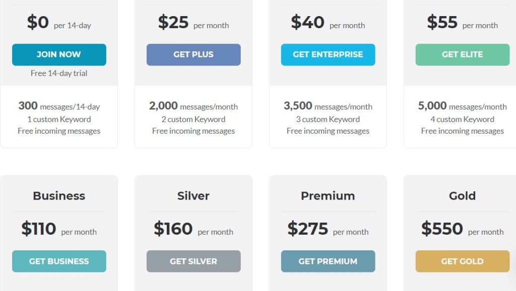
#7 A/B testing
It would significantly help your digital marketing activities if you decided to include A/B testing in your strategy. In case of your pricing page, testing your design or title sounds professional but when it comes to prices, the question becomes more complex and even dangerous. Imagine you sell the same product at $29 per month, then after a few months you raise the price to $39 and then charge $29 again. Nobody wants to be deceived and pay more than a product’s actual value is. But if you are serious about your price testing, be extra careful regarding how long your split testing will last, what changes you are going to make to your prices and what features you will include in every plan.
When ideas and colors matter: 6 Impressive Examples of SaaS Pricing Pages to Inspire You
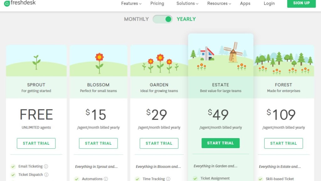
In the end, we have created a gallery section for you – creative approach, memorable design, and deep idea. #1 EmailOctopus is an email marketing service provider that helps send emails to subscribers via Amazon SES account. Their pricing plans openly demonstrate the situation in the market where shrimps, tunas, stingrays, sharks, and whales compete with each other. So the companies have to choose a plan based on what size of “fish” they are in the market.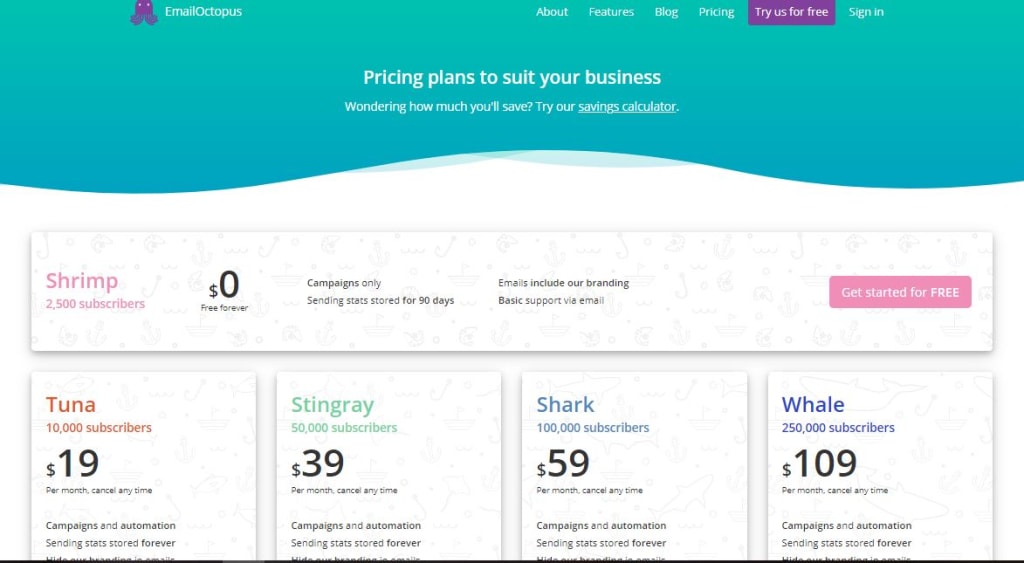 #2 Freshdesk is a cloud-based customer support software. They again have found a creative way to make a differentiation among small, medium-sized and large businesses. Customers have to figure out whether sprout or blossom is enough for their needs or creating a garden/estate/forest is what they actually want to build.
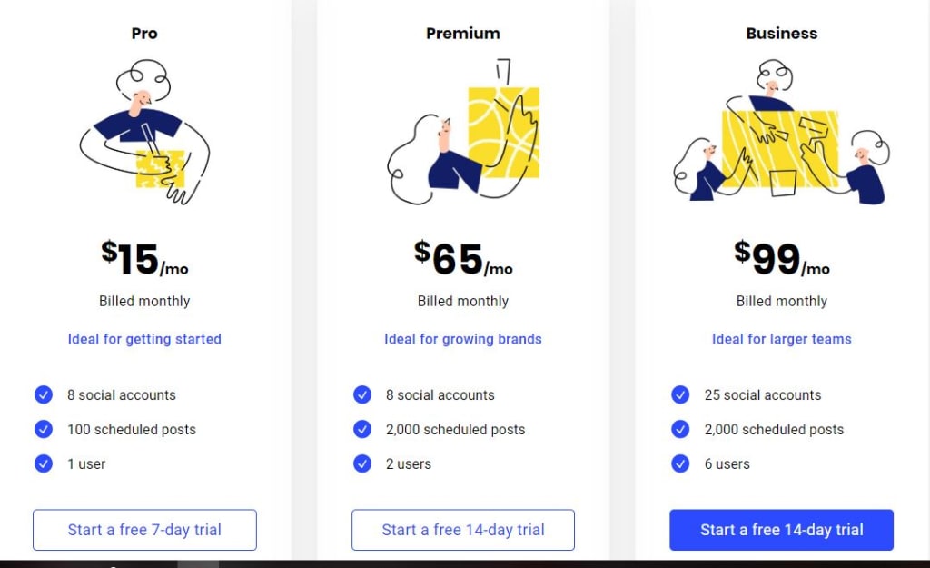
 #3 Buffer is a social media management software and helps schedule your social media content. Let’s agree that their designers have done a great job: a beginner painter matches with Pro (=startup), a mid-level painter best suits the Premium (=growing business), and advanced painter is compared with the Business level (=large company).
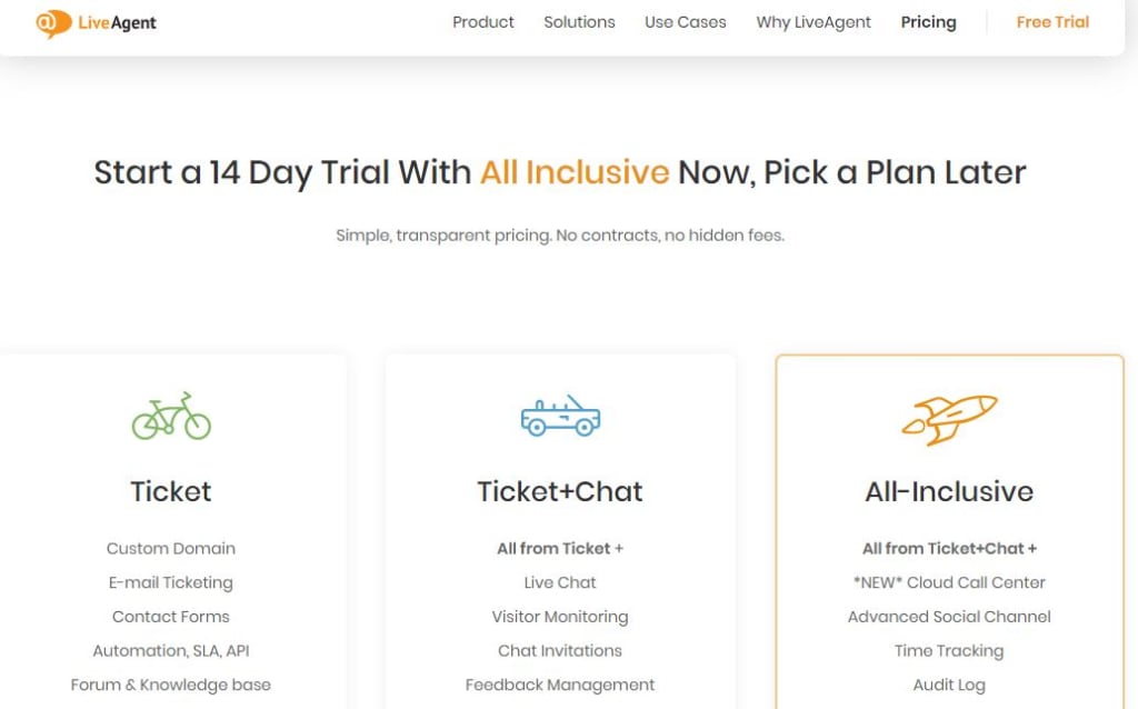
 #4 LiveAgent is a help desk and live chat software. On their Pricing section, they not only use three different colors for three different plans but also have approached businesses in a unique way by matching their needs with a vehicle’s opportunities. A bicycle is basically used for fewer needs, a car is something in between and a rocket means speed and advanced features.
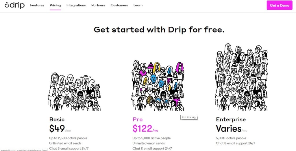
 #5 Drip is CRM software for e-commerce. In their Basic plan, you can see a small team of around 20 members which obviously refers to small businesses. The larger the team, the higher the pricing plan. Another interesting thing is that by default all three teams are in black and white. And once you hover over a plan, it adds blue, pink and yellow colors to the team members.
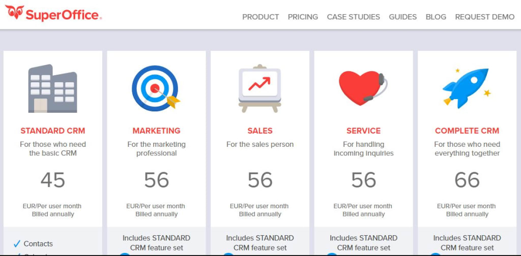
 #6 SuperOffice is CRM software for sales, marketing, and customer service. The dart board symbolizes that the right targeting is the primary marketing goal, increase is revenue is the primary goal for sales, and the customer support should be provided with love.
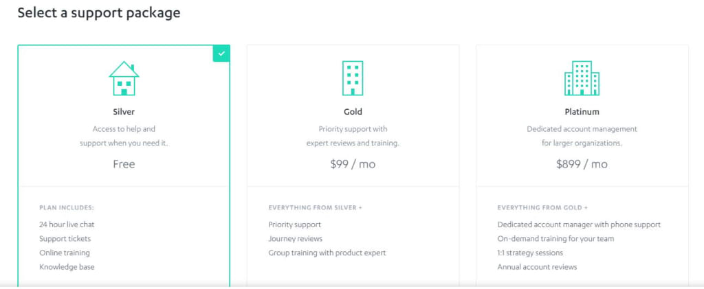
 7# Autopilot is marketing automation software. In this case, a house symbolizes a small business with basic demands, while a building and a premise point to growing and established businesses whose needs and goals are more complex.
 That’s basically all we would like to share with you related to the best practices of SaaS pricing pages. Share your own experience in the comments below, follow the best practices and close as much as you possibly can!
Tags:
SaaS Pricing
July 1, 2020


Comments