If you want to build a website for your SaaS business or improve the existing one, you should be aware of an important distinction — is your product intended for B2C or B2B users? Although the distribution model is the same, that’s pretty much the only similarity between the two markets.
As they cater to different target audiences, B2C and B2B websites don’t prioritize the same elements and tactics. The fact that B2B SaaS products are more complex feature- and functionality-wise leads to longer sales cycles and requires demonstrating value and ROI to potential customers.
On the other hand, B2C SaaS companies focus on engaging user experiences and selling emotions.
These rules aren’t set in stone, and although both site types can incorporate elements of the other’s strategies, the following differences (and tips) are based on customer behaviors and industry best practices.
1. B2C Sites Capitalize on Impulse Conversions
Typical B2C SaaS products are less complex than their B2B counterparts. They tend to have fewer moving parts, address fewer needs, and can be considerably cheaper.
Compare the user-facing functionality of a B2C product like Netflix to that of a B2B offering like HubSpot. These two SaaS companies’ functional scope varies quite drastically – a fair generalization to make about a core difference between these two types of SaaS products.
On top of this difference in sophistication, B2B customers’ decisions also tend to be driven by “committees”. It’s very rare that a business will sign up for a recurring payment without first having various stakeholders perform a cost-to-benefit analysis.
B2C customers aren’t encumbered with this kind of governance. The purchasing decisions are often theirs and theirs alone.
All this means that consumers more frequently make snap purchasing decisions, something that B2C websites can take advantage of by incorporating sales elements such as limited-time offers, FOMO, and refund promises.
“Free” is the magical, open-sesame word that makes prospects click on the Subscribe Now button. According to surveys, more than 64% of online customers wait for the product they’re interested in to be on sale before purchasing it. Similarly, almost 60% search for promo codes before buying anything. It’s obvious that freebies and discounts work well in B2C, so make sure to display such offers on your website and make them visible. This tactic will encourage impulse conversion and boost your sales.
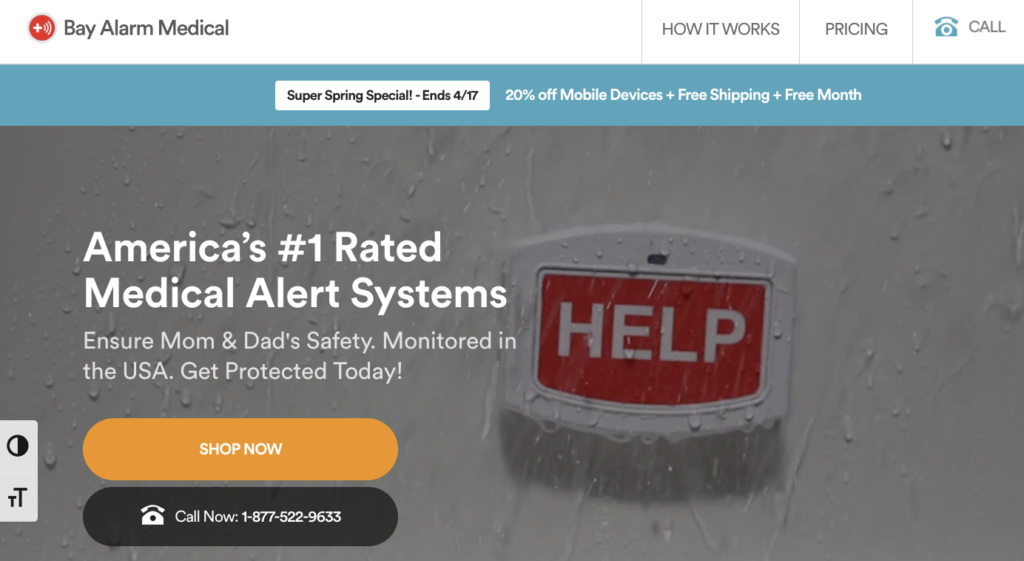
For example, the Bay Alarm Medical homepage features a permanent “Sale/discount” message above the header. All their customers get a free month plus a seasonal discount, which is a desirable offer that will speed up the decision-making process.
The B2B sales cycle is significantly longer due to multiple stakeholders and an approval pipeline for new expenses. There are somewhere between 6 to 10 decision-makers, all of whom want to discuss at least five pieces of information each.
Additionally, B2B solutions are usually to be used by the entire team, department, or company, which means more than a single user. All this increases the price so that the stakes are high too.
Finally, B2B buyers need to make sure their investment is worthwhile, so they also extensively research and evaluate offers from different vendors, which takes time.
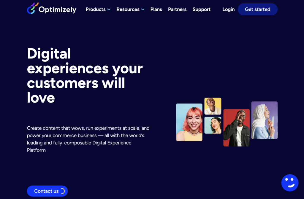
In light of all these factors, a professional B2B website like Optimizely would lose its credibility by awkwardly splashing a “Limited-Time Offer” message on its homepage.
Such an approach would demonstrate a lack of understanding of their audience’s needs by downplaying the complexity of the product itself and making it come across as something that doesn’t require serious consideration. Needless to say, it would damage their brand reputation and erode their customers’ trust.
2. B2B Sites Sell Results Over Emotions
B2B sites describe the value of their product as something measurable — an outcome that buyers can expect if they implement the solution. They promise their customers will achieve particular goals and quantify these results by crunching numbers.
If we bear in mind that B2B decision-makers are driven by logic, prioritizing tangible benefits and results such as efficiency, ROI, or cost-savings is exactly what a successful, trustworthy B2B SaaS website copy should insist on.
Data plays a critical role in convincing B2B buyers that a particular SaaS solution will deliver. So, providing stats, customer testimonials, case studies, and certifications is a must. These instruments will offer compelling and credible evidence of how the product helped other businesses solve their pain points, improve efficiency, boost performance, or save time and resources.
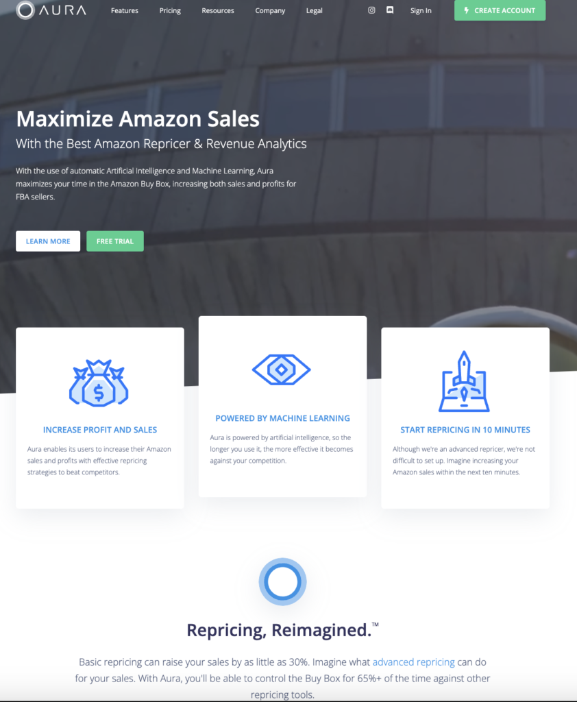
The Aura homepage claims their customers will “win the buy box,” which is the holy grail of all Amazon sellers. This promise catches the eye of prospective customers and gets them to explore the product further.
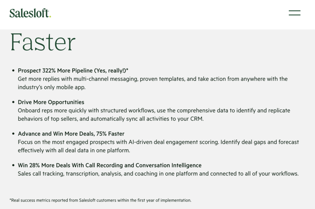
Similarly, on their See It Live page, Salesloft illustrates all the benefits of using their sales engagement platform by showcasing success metrics reported by the existing customers within the first year of implementation. This approach also doubles as powerful social proof as it’s what happy customers say and not just what the vendor claims.
On the other hand, B2C companies try to connect with their customers on a more abstract, emotional level. Given that their products aren’t necessarily used for business purposes but for entertainment, personal development, health tracking, or storing data, to name just a couple of uses, B2C SaaS vendors can successfully target their customers’ feelings.
And psychology corroborates the concept of emotional selling by revealing that 95% of purchasing decisions take place in customers’ subconscious minds and that they’re not as logical and rational as we may think. So, if you want to boost your B2C sales, then your messaging will be much more effective if it evokes certain positive emotions — happiness, relief, accomplishment, or safety in your customers.
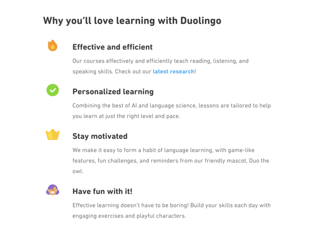
DuoLingo’s homepage is a great example of this tactic. Instead of giving stats on how the product impacts customers, listing how many people learned another language using the app, or how long it took them to do so, the brand chose to sell something less tangible and measurable. The choice of words and content in the “Why you’ll love learning with Duolingo” section clearly intends to appeal to customers’ emotions rather than employ metrics or numbers.
3. B2B Sites Encourage a High-Touch Sales Process
B2B companies understand the value of establishing meaningful relationships with their customers.
For them, a sale takes longer, but the relationship-building aspect of the sale means that churn is lower and LTV is higher. Thus, they have CTAs and other messages that encourage personal interaction with their sales team.
Such a high-touch sales process helps B2B companies to:
- Establish trust
As we’ve already discussed, B2B SaaS products typically require a hefty investment, so buyers need to trust the vendor completely before making a commitment. 88% of B2B buyers decide to purchase only if they perceive a salesperson as a trusted advisor whose ultimate goal isn’t to close a deal and earn a commission. More touchpoints present a greater opportunity to better understand your customer and their needs and demonstrate why your solution is the perfect fit, thus helping them solve their pain point and adding real value.
- Customize their offerings
B2B SaaS products usually don’t come out of the box, which means that every customer can tailor the solution to meet their needs. This is why a single interaction doesn’t cut it.
- Educate their customers
B2B SaaS solutions are complex, and buyers need education and support to better understand how to make the most of them. A high-touch sales process allows sellers to explain how each product feature works, present some best practices, and provide ongoing support.
B2C sites aim for speed and quantity.
Impulsive decision-making, affected by emotions, promotions, and discounts, makes B2C customers somewhat fickle. That’s why B2C vendors can’t afford to rely on a small customer base; what they need is a steady stream of new business opportunities.
For them, shortening the sales cycle is crucial as it means more conversions. B2C buyers are also more price sensitive than B2B ones, and consequently, they have significantly smaller budgets. Therefore, investing too much time and resources into a single sale isn’t an option.
Similarly, lower switching costs allow customers to try out different products and opt for a different vendor if the price is lower. As a result, churn rates are higher and LVT is lower. To make up for all this and still gain profit, B2C vendors must reduce their “cost per acquisition” metric as much as possible.
The bottom line is that their conversion messaging and signup process must be short, simple, quick, and risk-free.
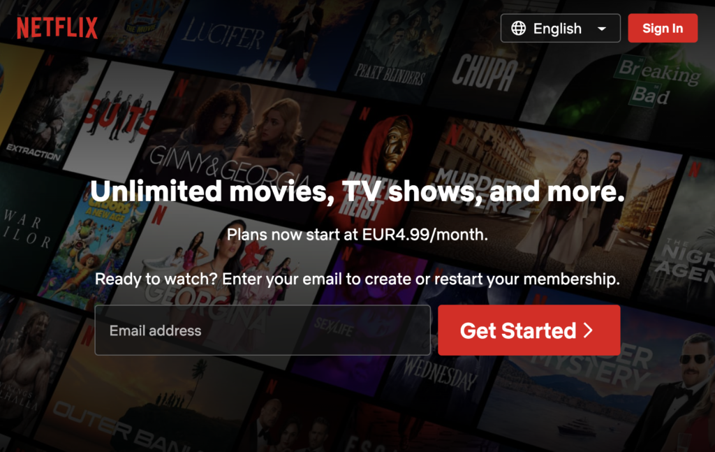
On its homepage, Netflix employs a bold and highly-visible CTA, reading “Get Started” and prompting visitors to enter their email address and create an account. The process is very user-friendly and intuitive while taking no more than a couple of minutes to complete. Plus, customers are informed about the number of remaining steps before their account setup is done. By doing this, the streaming giant minimizes the odds of customers abandoning the signup process midway.
4. B2B Sites Illustrate Product Functions in Greater Detail
B2B companies sell concrete products and services, capable of producing specific, measurable outcomes. Simultaneously, B2B leads have very precise and demanding requirements, which is why they take their time assessing every angle of the offering rather than signing up impulsively.
So, to close a deal successfully, it’s essential to focus on presenting your product’s features, benefits, and functionality in detail. Because they have so much diligence, they care about the “How.”
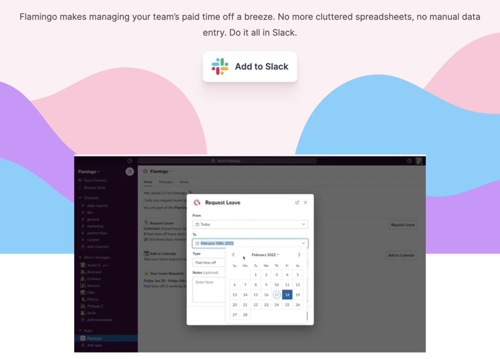
Flamingo puts so much emphasis on explaining how their product works that they decided to place the video above the fold on the homepage for their potential customers to see right away before exploring it any further. Demonstrating the product’s function early on in the process will capture your prospects’ interest and push them down the funnel.
B2C sites often cater to emotional impulse buyers. Unlike B2B leads, who typically exercise more due diligence, B2C customers aren’t interested in seeing how the product works before signing up for the first month. That’s why B2C sites can focus their energy on describing what the product does and making an emotional connection with the audience rather than thoroughly illustrating how the product functions. Details such as button placement or a sequence of events when using a product don’t play an important role to B2C buyers.
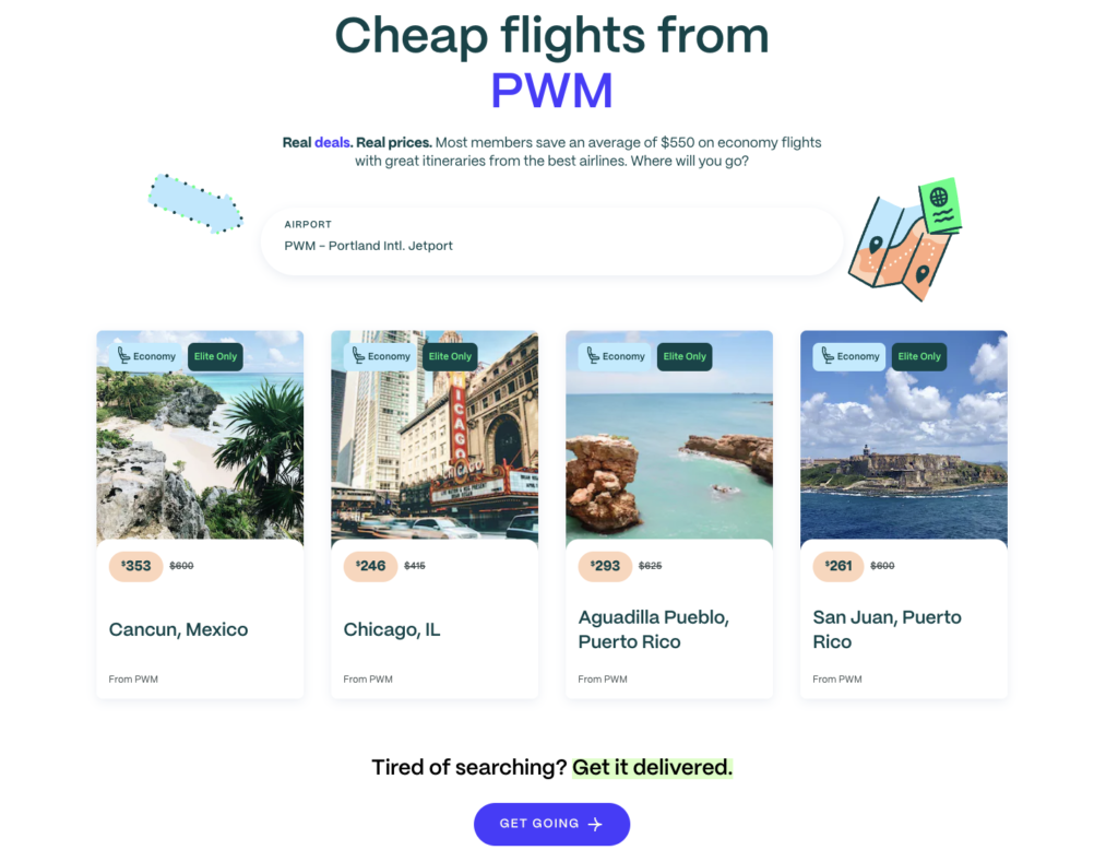
Going doesn’t explain the process either on their main Cheap Flights page or elsewhere on the site. They don’t focus on HOW but emphasize the ultimate benefit. The company invests its time and energy in highlighting WHAT by displaying aspirational images of cool destinations.
SaaS Products That Target Both Businesses and Consumers
It’s not uncommon to find SaaS companies that count both businesses and consumers as part of their customer base. In these cases, it’s important to consider the nuances of the product and its place in the market when choosing how to approach the four points we discussed in this article.
Let’s take a look at two examples.
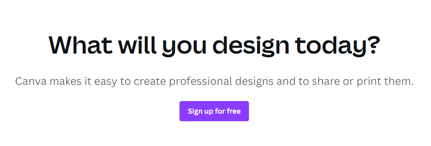
Canva aims to attract both amateur graphic designers who want to easily throw together a birthday party invitation and agencies who want their teams to collaborate on digital assets.
However, on the surface, it appears as if their messaging skews towards the B2C segment.
- There’s a very clear message about the platform being affordable – even the website’s HTML title starts with the word “Free”. The site’s most visible CTAs also focus on this selling-point.
- Value propositions tend to lean towards the abstract, with the platform’s affordability and accessibility getting slightly more airplay than B2B-friendly concepts like collaboration.
- Conversion happens online and enables a quick purchasing decision. There is virtually no visible reference to an offline component to its sale process.
- Somewhat contradictory to the site’s bias towards B2C messaging is the detailed illustration of product functionality. Canva doesn’t hold back when showing users how their product operates.
Now let’s take a look at the other side of this comparison: Zoom.
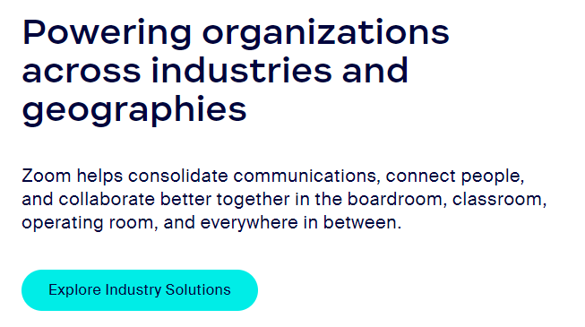
The web’s leading communications platform brings together families that are scattered across the world as well as decentralized enterprise teams collaborating on complex business projects. But it seems like their site’s messaging leans very slightly towards engaging the latter group.
- The term “Free” is used sparingly, but visibly. With two CTAs carrying this B2C-friendly message.
- Value propositions focus on functions over feelings. Core benefits are all very clearly aimed at B2B customers.
- Conversion functionality is nicely balanced between B2B and B2C signals. One CTA encourages users to contact the sales department while its neighbor nudges them towards signing up right away.
- A massive amount of the website’s real estate is dedicated to illustrating the depth of the product’s functional offerings, with virtually all of these messages illustrating business functions.
This nuanced approach to presenting their products to the two groups of potential customers tells us that these SaaS companies are likely to base their messaging on a very granular view of their target audience.
It also suggests that there are no easy answers here. If you play in this space, it’s vital to understand the role your product plays in the professional and personal lives of your target audience and to cater your messaging accordingly.
Wrapping Up
Understanding these four key differences between B2C and B2B SaaS websites will allow you to create an authentic online presence that is aligned with your target audience’s expectations.
While B2C websites champion simplicity, user experience, and emotional appeal, their B2B counterparts put emphasis on functionality, providing technical information about the product, and cultivating long-term relationships with customers. These distinctive characteristics will give you a sense of direction and help you optimize your website depending on the type of SaaS landscape in which you operate.
Tags:
SaaS GrowthApril 25, 2023


Comments