High-impact Ideas for Your SaaS Landing Page: This Is What You Need To Know for 2021

High-impact Ideas for Your SaaS Landing Page: This Is What You Need To Know for 2021
The most important pages on a SaaS business website are definitely its landing pages. Main advantages and benefits of designing it in a careful way?
- Lead generation
- Improving SEO
- Driving traffic to your website
- Leaving strong first impression
- Data collection (demographic information about prospects)In the past years we have witnessed several trends in landing page design ideas that were quite often used in websites of SaaS companies. The changes and updates of Landing pages happen quite often as the better performing UX design ideas and trends enter the market. Here we are going to address some of the vital questions such as why are landing pages so important for SaaS businesses, what are the best practices when building one and, in the end, we are going to share with you some of the best landing page examples.
Why is a Landing Page so Crucial for SaaS Companies?
When compared to other business models, the success of a SaaS business relies on the engaging potential of its website, more particularly the landing page. There is no physical store and customers don’t have the chance to have a face-to-face conversation with a salesman.
The landing page is the prospect’s first contact with a SaaS brand and, as such, it has to be beyond perfect. It must be able to serve as an all-in-one-page representation of a SaaS business and what it has to offer, and must also have the power to convert prospects into customers.
Obviously, there is a lot that SaaS businesses expect from a single web page, but experience has shown that this is achievable. What makes it difficult is the attention span of the average internet surfer, which is only 8 seconds. This means that thousands of SaaS companies are competing for these 8 seconds.
According to WordStream, 52% of of businesses who have created landing pages also test them to understand which version performs better, removing navigation menu can increase conversions by 100% and optimal number of required fields to be filled in is 3. As you can see, measuring your results and constantly working on them, keeping the visitors concentrated and saving their time are factors you should definitely think over.
Now, let’s discuss some examples of best-converting landing pages.
Cigital – A Software Security Firm
Cigital is a software security firm, and their landing page has an amazing conversion potential. Why? Because it is not overloaded with images, which means that it was created with the target audience’s preferences and expectations in mind. People arriving on this landing page want to find out more about how to take control of the risk management process.
The call-to-action button is right where the mouse cursor naturally falls, the bottom right, and it is nicely placed below the form. The headline is simple, yet quite informative. Below it, Cigital includes a short description of the ebook. This allows users to asses the offered value and to proceed to the CTA.
There is, of course, some room for improvement. First of all, their landing page includes the website menu, which may cause a distraction and lead visitors away from the CTA. Also, the number of form fields exceeds the number which is recommended for the best conversion potential of a form.
Desk – Customer Support Software
Salesforce’s Desk is a customer support software solution and their landing page is a true killer when it comes to conversions. The moment you arrive on it you can clearly see a tagline, a short demo of their product and a clear CTA button in turquoise color. The “Try Desk.com For Free” button stands out from the background, but it still falls in nicely with the landing page design and color palette.
The whole look of the landing page puts those arriving under the impression that they just took a sit at a desk. A video wrapper is placed on the screen of a tablet lying on the desk, with a play button that immediately opens a short product overview video. The website navigation bar is present on the landing page, but it was made to be non-intrusive. As you can see, it fades in and out when a user performs a scroll action.
The only downside of having a onclick popup video on the landing page is that you lose sight of the CTA button, so people have to perform more actions to get back to it. But in this case, I assume that serious A/B split testing was conducted and that having a video on the landing page has good conversion potential for Desk’s target audience.
Zendesk – CRM Software
Zendesk is a famous SaaS company that builds amazing customer relationship management software. We’ve intentionally picked this one to discuss some common mistakes made when designing the landing page. As you can see, Zendesk’s landing page is blue, but everything else is blue as well, just in different shades. For this reason the CTA doesn’t stand out and prospects might get confused when they arrive on the page.
The Headline is short, effective and engaging. On the other hand, what is a demo? What is a trial? What am I going to get if I click on one of these? Perhaps Zendesk’s intention is to encourage visitors to scroll down while the main menu remains sticky, so that anyone can get started if the content down below is persuasive enough to make them “Get Started”.
The current concept of their landing page only allows a complete redesign if the page is going to be made better in terms of conversion and engagement. The first segment is definitely as informative as it should be, and the color palette makes elements in the layout too blended together.
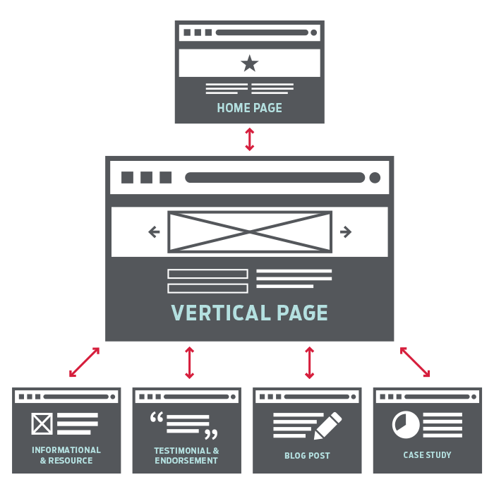
Ideal Landing Page Structure

source: gravitatedesign.com
The must-have elements in a landing page structure are the navigation bar, the headline, the call-to-action (CTA) and social proof. The hero and the page length (one screen or scrollable page) also deserve much attention. Here are some tips on how to design each of these elements to get the most out of your Landing Page.
Navigation bar
As we could see in the Salesforce’s Desk landing page example, the navigation can be made less disruptive with some fade out and fade in effects. It is important to have one, because the navigation bars have been here with us from the very first days of the internet. In other words, users expect them.
It will help users to navigate more easily when they arrive on your landing page for the first time. Users might also want to find out more about your product, pricing and company information before clicking on the CTA. This is why providing them with a navigation bar containing links to pages of interest might prove quite useful.
The number of a fixed navigation bar items should not exceed four. If your target audience appreciates access to more information feel free to include the sitemap at the bottom of the page. In some cases it may be beneficial to completely remove the navigation bar from the landing page. Take a look at some data that might reveal the answer to this question.
The Headline
100% of SaaS companies use headlines to pitch their products. This headline should be short, engaging and easy to read. Google keeps things very official and professional: “Get email for your business.” Zendesk wants to appear more friendly with their: “We can lend a hand”, while Zoho CRM uses the headline to communicate the benefits of using their software: ”Get ready to sell, Smarter, Better, Faster.”
While Zoho’s one is the most frequently used types of headline, make sure to know your ideal buyer persona before you come up with the headline.
CTA
The CTA button should be clearly visible. It has to pop out from the background seamlessly. The message it contains should really be short (no longer than 5 words) and it should reflect the action a user has to take.
For instance, “Create a Free Account” is better than “Create an Account” and “Get your Free Ebook” is better than “Dowload Ebook”. See how Trello nails it in the image below.
Social Proof
If you want to learn from some of the best converting landing pages, then you should definitely pay attention to how the best SaaS companies promote confidence in users and remove hesitation out of the equation by using social proof (social media buttons, customer logos, links to case studies and quotes from your customers).
Zendesk decided to place customer logos on its landing page. It looks neat and really complements the design of their landing page.
You should consider placing a photo of a human on your landing page if you want to help your audience relate to your brand. This is a good option if you want to impress the visitors the moment they land on your page.
Since SaaS business model lacks that human factor, showing a human face on the landing page can inspire emotion in your visitors and help you convey the emotional aspect of your headline message. Google nails this one with their GSuite landing page. They give us the hero, who is at the same time a customer (social proof).
Page Length
Page length is also an aspect of a landing page that’s worth considering. Since scrolling is a natural action of every web surfer, having a scrollable landing page is not generally a bad idea, especially if you want to provide additional information to the users interested in your service.
If you have a lot of engaging content for your landing page, it is a good idea to spread it out. If you do so, don’t forget to make sure that the first screen of your landing page contains everything a customer needs to click on a CTA.
Wistia’s landing page, for instance, is a perfect example of scrollable content that gives the users everything they need to make the decision to start using their platform. However, their color palette choice is up for discussion, e.g. yellow CTA buttons would be a much better option.
As you can see, there is no cookie cutter solution when it comes to making top converting SaaS landing page. It appears that most SaaS companies follow only a few general rules – the engaging headline, clearly distinguishable CTA button, social proof, demo version, neutral background and fixed fade-out menu.
But the landing pages of successful SaaS companies are designed to complement their brand and custom tailored to give exactly what their target audience requires. In addition, SaaS companies build several different landing pages to increase the efficiency and conversion rates of their marketing campaigns.
Tags:
SaaS Lead GenerationNovember 17, 2020
![How to Optimize Your SaaS Pricing Page in 2021? [Complete Guide 2021]](https://incredo.co/hs-fs/hubfs/Imported_Blog_Media/20-01-scaled-1.jpg?width=520&height=294&name=20-01-scaled-1.jpg)


Comments